SHFT
Responsive Web Design
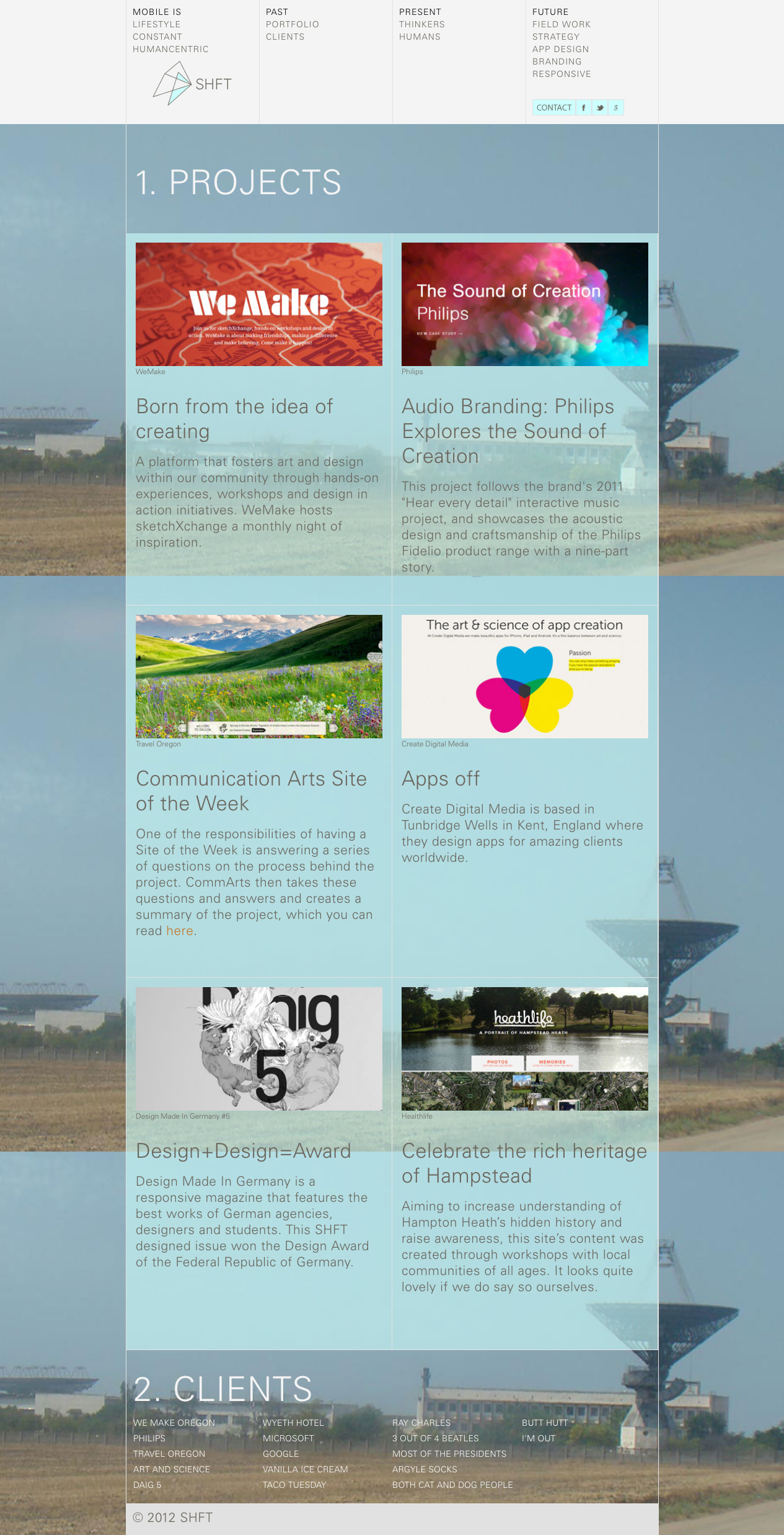
Responsive web site for the fictional strategic design and consulting firm SHFT. I was responsible for the overall visual design, content layout and branding. Collaborators on this project were Krispijn Larrison and Brandy Collins.
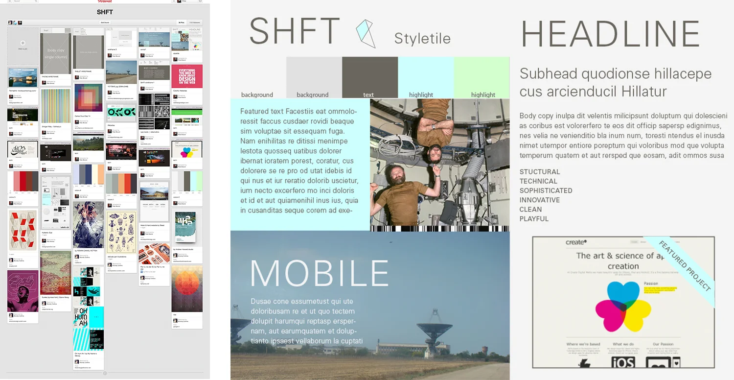
A group Pinterest board was used to gather inspiration for the site. Style Tile: a slightly irreverent and take on space travel was used as a metaphor for mobility and forward thinking. Multiple possibilities for color were explored.
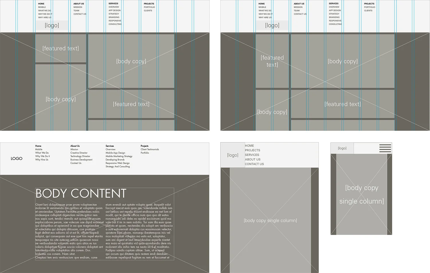
Iterations of wire frames aligned to fit the responsive grid used for the project.
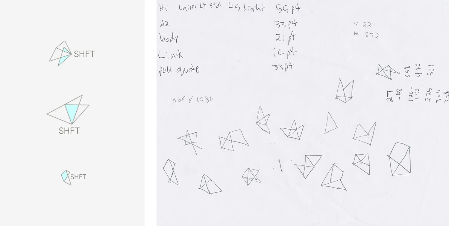
Dynamic logos that change at break points for desktop, tablet and mobile screens.
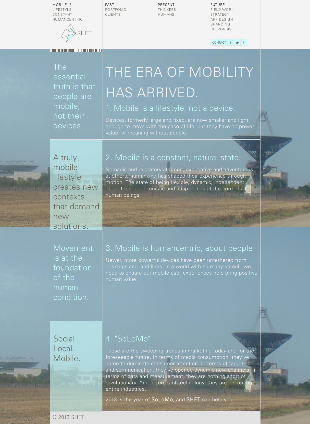
Full page layouts designed to be readable and engaging on all screen sizes. The typographic hierarchy was created with the online tool Typecast.

